In the world of events and retail, a custom roll-up banner design is often the first point of contact with your audience, instantly signaling your brand, value proposition, and event theme while operating in busy, noisy environments where a single glance must convey meaning. To maximize impact, consider the roll-up banner layout as the skeleton of your message, guiding readers from a bold headline to concise supporting details, then to a clear visual cue such as your logo or a QR code, all while maintaining generous negative space. A thoughtful approach to banner color theory ensures readable contrast, brand alignment across materials, and emotional resonance that nudges attendees toward your offer, even under variable lighting. Typography for banners must balance legibility with personality, using a bold, high-contrast headline paired with clean body copy and a straightforward call to action; keep line length concise, line height comfortable for quick scanning, and avoid competing fonts that dilute the message. When you prepare files for production, design choices should translate smoothly into print-ready roll-up design specifications, with precise bleeds, safe margins, scalable vector or high-resolution raster elements, and clarified color spaces to ensure your final banner reads clearly from a distance and across venues.
Beyond the core design, the same ideas apply to portable display banners and trade show signage, where a clear message, consistent branding, and a deliberate visual order help attendees grasp your offer at a glance. Use pull-up banners or stand banners as complementary touchpoints that share a cohesive color system, legible typography, and a straightforward CTA, ensuring your booth communicates your value across different environments. By treating display graphics as a connected system—across banners, posters, and handouts—you can maintain brand identity and streamline production workflows with print-ready assets that translate well from screen to print.
1. Roll-Up Banner Layout Essentials for Quick Message Delivery
In any roll-up banner, layout acts as the map that guides the viewer’s eye to the core message. Focusing on a strong focal point, a clear visual hierarchy, and a balanced grid helps you communicate at a glance. This is the essence of the roll-up banner layout, which determines how quickly your audience reads and reacts as they pass by.
A practical layout approach emphasizes a two- to three-tier hierarchy, placing the most important element—the headline—at the top or center. Maintain ample negative space and a safe zone around edges to ensure readability from a distance and to prevent crops during production, creating a high-impact banner design that remains legible in real-world environments.
2. Banner Color Theory: Readability, Brand Alignment, and Impact
Color is a powerful language that communicates mood, urgency, and brand identity. The banner color theory you apply should reinforce recognition by aligning with your brand palette while ensuring legibility from several meters away. Start with a dominant hue and use a supporting color for accents to guide attention toward the key offer.
Contrast and accessibility are central to effective banner color theory. High-contrast combinations improve readability under varied lighting, and color should never stand alone—pair it with clear typography and icons for meaning. Balance vivid saturation with white space to keep the banner visually dynamic without sacrificing legibility.
3. Typography for Banners: Legibility and Hierarchy
Typography for banners must read clearly from both a distance and up close. Limiting to two fonts—one for the headline and one for body copy—creates a clean, consistent look. A bold, oversized headline quickly captures attention, while lighter body text supports the message without overwhelming the viewer.
A well-planned typographic hierarchy guides the eye: headline first, then supporting copy, followed by a CTA or brand cue. Keep copy concise and optimize line length to avoid long blocks of text. Proper line height and strategic spacing ensure quick scanning, making typography for banners a critical component of any high-impact design.
4. Print-Ready Roll-Up Design: From Artwork to On-Display
Print-ready roll-up design requires careful attention to production specifics. Ensure artwork includes appropriate bleeds, safe margins, and alignment with standard dimensions so the final banner trims correctly. Deliver files in formats printers accept, typically PDF or TIFF, and use CMYK color space to preserve color accuracy across devices.
Before finalizing, verify crop marks, margins, and overall balance against the grid you used in layout planning. A print-proof is invaluable to confirm color density, readability, and image sharpness in the real-world print environment, helping to avoid surprises once the banner goes on display.
5. High-Impact Banner Design: Creating a Visual Hook and Clear CTA
High-impact banner design hinges on a compelling visual hook and a decisive call to action. Establish a strong focal point with size, weight, and color contrast to draw viewers in as they walk by. Effective imagery and a clean layout support the core message, so the audience can grasp the value proposition within moments.
Keep the message concise and focused, using minimal copy and a prominent CTA. A two-step reader journey—notice the offer, then act—works best in busy environments. Integrating the layout, color, and typography choices enhances readability and elevates the banner’s overall impact.
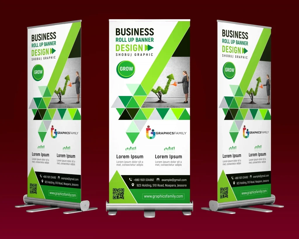
6. Custom Roll-Up Banner Design for Events and Retail
A custom roll-up banner design is tailored to the specific event or retail setting, aligning layout, color, and typography with the audience and venue. Start from a clear objective and audience profile, then adapt the roll-up banner layout to optimize sightlines, crowd flow, and focal points within that space. This ensures your banner stands out in competitive, crowded environments.
From color theory to type choices, a custom approach considers brand identity, venue lighting, and interaction opportunities (such as QR codes or booth demos). By testing and iterating—while ensuring print-ready roll-up design standards, correct bleeds, and color calibration—you produce a banner that is not only visually compelling but also performance-driven in real-world settings.
Frequently Asked Questions
How does roll-up banner layout influence a strong custom roll-up banner design?
Roll-up banner layout sets the reading order and visual rhythm. For a strong custom roll-up banner design, place a clear focal point, apply a simple hierarchy, and use a grid with generous negative space to keep content legible from a distance.
What role does banner color theory play in a custom roll-up banner design?
Banner color theory drives contrast, mood, and brand recognition in a custom roll-up banner design. Start with a dominant brand hue, add an accent color, ensure high contrast for legibility, and consider accessibility by not relying on color alone.
What typography for banners strategies optimize readability in a custom roll-up banner design?
In typography for banners, use two fonts max and assign one to the headline and one to body text. Use bold headlines for emphasis, maintain hierarchy with size and line height, and keep copy concise to support quick scanning in a custom roll-up banner design.
What makes a print-ready roll-up design suitable for production?
A print-ready roll-up design uses print-friendly file formats (PDF or TIFF), CMYK color space, and proper bleeds and crop marks. Ensure logo safety zones, align elements to the grid, and confirm dimensions so your custom roll-up banner design prints accurately.
How does high-impact banner design balance layout, color, and typography for a custom roll-up banner design?
A high-impact banner design achieves balance by pairing a strong focal point with high-contrast colors and legible typography. Align layout, color, and type to reinforce the brand, guide the viewer toward the call to action, and ensure readability from several meters away.
What practical tips ensure a successful custom roll-up banner design from concept to print?
Practical tips include defining the objective and audience, sketching a grid layout, testing color contrast, and producing print-ready assets with bleeds and crop marks. Request a proof, verify branding consistency, and confirm stand dimensions to ensure your custom roll-up banner design performs in real world environments.
| Aspect | Key Points |
|---|---|
| Goal & Audience | Clarify banner purpose (product launch, sale, booth demo) and audience; objective is to convey core message at a glance, provide a visual hook, and direct the viewer to take the next step (visit booth, scan QR code). |
| Layout Principles | Establish a strong focal point at top/center; use a simple visual hierarchy (headline > supporting copy > CTA/brand cue); build a grid; maintain ample negative space; keep critical text/logos inside safe zones to avoid edge cropping. |
| Color Theory | Align with brand colors; ensure high contrast for legibility; consider accessibility (color blindness); use vivid but controlled saturation with white space. |
| Typography | Limit to two fonts (headline and body); use bold headlines; maintain clear hierarchy; keep copy concise; optimize line length for quick reading from distance. |
| Images & Visuals | Use visuals that support the message; place logo thoughtfully; ensure high-resolution images or vectors; use white space to reduce clutter; opt for minimalistic imagery when possible. |
| Print Readiness | Know standard dimensions; provide bleeds and safe margins; deliver print-ready formats (PDF/TIFF) in CMYK; include crop marks and ensure alignment; request proofs. |
| Practical Tips & Pitfalls | Avoid overcrowding, inconsistent branding, poor contrast, low-res assets, and missing call to action. |
| From Concept to Print | Ensure alignment with stand dimensions; maintain grid and margins; verify print readiness and accuracy before production. |
Summary
This concludes the summarized key points table. The HTML table above captures the essential guidelines for a high-quality custom roll-up banner design, focusing on goal clarity, layout, color, typography, imagery, print readiness, practical tips, and the journey from concept to print. The content emphasizes actionable steps to create banners that perform in real-world event and retail environments.