Custom roll-up banner best practices guide you to create a strong, portable marketing display that can make a lasting impression at conferences, trade shows, or product launches. A well-designed banner leverages roll-up banner color contrast to separate your message from the noise and ensure legibility from across a busy hall. Keep copy concise, use a single focal headline, and arrange imagery to support the core idea without overwhelming the viewer. A thoughtful approach to crafting effective roll-up banners with a clear typographic hierarchy helps readers from a distance and up close, reinforcing brand voice while guiding action. By balancing color, wording, and layout within brand guidelines, you can unlock quick recognition and a positive impression at any event.
Beyond the terminology, these portable display stands—often called pull-up banners—maximize visibility in crowded venues and act as compact signage for fast brand communication. They work as quick-read statements that capture attention with a bold headline and minimal supporting copy, making them ideal for trade shows, product launches, and showroom events. When treated like high-impact signage, they rely on clear contrast, readable typography, and a simple hierarchy to convey value at a glance.
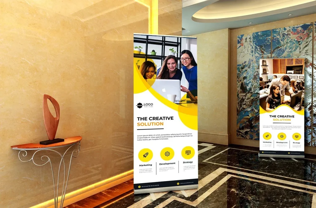
Clarifying Your Message with Custom Roll-Up Banner Design
A roll-up banner’s effectiveness starts with a clear objective. Understanding what you want attendees to think, feel, or do guides every design decision—from imagery to layout. In custom roll-up banner design, align the objective with your brand message so the banner becomes a conversation starter and a credible touchpoint at a conference or trade show.
A concise promise is the core value. The banner should advertise a benefit or solution in one or two short lines. Longer copy can be included, but the impact lives in a few words that are immediately understood. When you know the viewing context—whether from across a hall or up close—you can shape color, typography, and layout to support that objective, which is at the heart of designing effective roll-up banners.
Enhancing Readability with Roll-Up Banner Color Contrast
Color and contrast are the most visible elements on a banner. The color palette should align with brand guidelines while also maximizing visibility under varied lighting. High roll-up banner color contrast between text and background improves legibility, especially for attendees glancing from a distance. A practical rule is to pair a light text color with a dark background or vice versa, while avoiding clashing hues.
For banners moved between venues, test the color on multiple screens and print proofs to ensure the relationship between foreground and background remains strong. In the language of roll-up banner color contrast and banner readability best practices, color contrast is a usability feature that directly affects engagement and comprehension.
Typography that Performs: Roll-Up Banner Typography for Distance and Detail
Typography should read at distance while remaining true to brand voice. Roll-up banner typography should be legible at distance; choose one or two typefaces that reflect the brand and establish a clear hierarchy between the headline, subhead, and body text. Headlines should be large enough to read from several meters away, while body copy remains legible up close.
Practical guidelines include using bold or semi-bold weights for headlines and lighter weights for supporting text. Keep lines short and avoid long sentences on the banner. This approach aligns with banner readability best practices and reduces cognitive load for passersby.
Custom roll-up banner best practices: Designing Effective Roll-Up Banners for Layout and CTA
Designing effective roll-up banners starts with a strong visual flow. The eye should move from a compelling headline to supporting copy and a clear call to action, with generous margins and minimal crowding. Use imagery that reinforces the message rather than competes with it. This is a practical application of Custom roll-up banner best practices, ensuring the layout supports quick scanning in busy halls.
Place the call to action prominently but unobtrusively, using a color or button style that attracts attention without overpowering the message. A clean, balanced layout helps attendees process the key benefit quickly, whether they are across the room or at a closer distance. By staying aligned with design principles and brand standards, you create banners that perform consistently across venues.
Print Quality and Materials: Ensuring Color Accuracy and Readability
Print quality and material choice affect both color accuracy and legibility. Use high-resolution artwork and request print proofs to verify color reproduction before a full run. Consider lighting when selecting finishes; a matte finish can reduce glare and improve readability under artificial light, while a glossy finish can enhance color richness in suitable environments.
Testing across lighting conditions and venues helps prevent surprises. The production phase is part of the design process, so ensure that color balance and typography hold up when printed at full scale. Align finishes and materials with brand guidelines to maintain consistency and recognition across events.
Testing, Brand Cohesion, and Ongoing Optimization
Testing and optimization are essential, not optional. Before finalizing a run, compare variations with proofs or simulations, and observe performance under different distances and lighting. Gather feedback from colleagues and potential attendees to measure how quickly the message is understood.
Use these insights to inform future iterations and maintain a record of what resonates with your audience. In the language of designing effective roll-up banners, ongoing refinement is how you move from good to great, ensuring your banners stay aligned with brand goals and deliver consistent results across events.
Frequently Asked Questions
What are Custom roll-up banner best practices for color contrast and readability at events?
In Custom roll-up banner best practices, prioritize color contrast to maximize readability. Use a brand-aligned palette with high contrast between foreground and background (light text on dark or dark text on light), and test under different lighting to verify legibility from distance. This reinforces banner readability best practices by preventing visual confusion in busy environments.
How does roll-up banner typography influence Custom roll-up banner best practices?
Roll-up banner typography is central to Custom roll-up banner best practices. Choose one or two typefaces, establish a clear hierarchy (headline, subhead, body), use bold for headlines and lighter weights for supporting text, and keep lines short to maintain legibility from both distance and up close.
What should you consider in custom roll-up banner design to maximize impact?
Custom roll-up banner design should start with a concise message, a strong headline, and a clean layout. Use generous margins, avoid overcrowding, align imagery with the message, and place a prominent yet unobtrusive call to action to guide attendees effectively.
What are banner readability best practices for roll-up banners?
Banner readability best practices for roll-up banners include concise copy, short lines, large headlines, and legible font sizes. Maintain high-contrast colors, use simple language, and test readability from varying distances to ensure quick comprehension.
How can you apply designing effective roll-up banners across venues with different lighting conditions?
In designing effective roll-up banners, consider venue lighting, finish choices (matte to reduce glare vs. glossy for color richness), and print proofs. Test color balance across screens and in print to ensure consistency in different venues.
What common mistakes should be avoided in Custom roll-up banner best practices and how can you optimize?
Common mistakes to avoid include overcrowding text, using too many fonts, and color clashes with the environment. To optimize, stick to a single compelling headline, a supporting line or two, maintain consistent typography, and validate designs with proofs and stakeholder feedback.
| Key Point | Summary |
|---|---|
| Objective and Audience | Banners should make a quick, credible impression at events and guide attendees toward the booth by aligning design with a clear objective. |
| Concise Message | Use one or two short lines to convey a promise, benefit, or solution; ensure the message is instantly understood from a distance. |
| Color and Contrast | Choose brand-aligned colors with high foreground/background contrast; test across lighting conditions to maintain legibility. |
| Typography | Select 1–2 readable typefaces; establish clear hierarchy (headline > subhead > body); use bold for headlines and short lines for copy. |
| Layout and Visual Hierarchy | Lead with a strong headline; place supporting copy beneath or to the side; allow generous margins; ensure imagery supports the message. |
| Print Quality and Material | Invest in high-resolution artwork and proofs; consider finishes (matte vs glossy) and lighting to preserve color accuracy and readability. |
| Brand Consistency | Align with brand guidelines (colors, typography, logo usage) to improve recognition and cohesion with other assets. |
| Testing and Optimization | Test variations, gather feedback, and refine based on readability and performance under different conditions. |
| Common Mistakes | Avoid overcrowding, too many fonts, clashing colors, and overreliance on imagery; aim for a simple, focused banner. |
Summary
Conclusion: Custom roll-up banner best practices guide the ideal balance of color, contrast, readability, and concise messaging to create banners that perform across venues. By maintaining brand-aligned visuals, a clear hierarchy, and tested print quality, you ensure quick scanning and lasting impact for attendees. When applied consistently, these practices help banners become effective ambassadors for your brand, delivering a clear message and inviting action at every event.